Let’s talk color
People get easily spooked by color. I know this for a fact, I’ve seen it up close and personal for many years in the knitting industry. It’s so pervasive that the big knitting magazines used to send out heads up warnings before new issues came out because they knew everyone would want to knit that cover sweater in Exactly That Color, No Other.
I co-owned a shop next to a yarn store for a few years (shout out to River Colors Studio in Lakewood, Ohio and its wonderful owner, Erika!), and we had a big set of French doors that connected both shops. Frequently I’d get the yell: hey Shannon! c’mere! And it was usually a color-picking dilemma. Does this go with this? We need to pick a third color for this. The original pattern uses this but Erika doesn’t have it and I don’t know what else would look good. *scream*
THIS IS MY SUPERPOWER. HONESTLY.
Color, I’m good at. My artist mom realized this early on even as other art forms annoyed me because I couldn’t develop the same level of skill I wanted. Color never frustrated me. Color came instinctively.
You can study color. You can get better at it over time. A lot of it is practice. There’s definitely some instinct involved, particularly if you are evolving a personal palette for design purposes, but the more you work on it the better. I have an entire Pinterest board called Colors where I pin striking images when a color (or combination of colors) jump out at me. It helps to have photo references and look at interesting combinations that occur in nature.
Several years ago I was taking a color theory class for knitters with Kaffe Fassett at TNNA. This class was probably the best class I’ve ever taken at a conference, and if you ever have a chance to learn with him in any way, sign up immediately. In addition to knitwear he is of course also a painter, quilter, needlepointer and so much more—if it involves combining colors to make something beautiful, sign him up. So you can imagine what a class is like… we had dozens upon dozens of tiny balls of yarn to choose from to make up our palettes and learn how to combine them in different ways, it was fantastic. But the part that stuck with me years later was an offhanded remark he made after lunch. (This was an all-day class).
Remember the dark days of the eyelash-faux fur-fancy yarn explosion when many a yarn store owner would knit these ENORMOUS poncho wraps using a strand of what seemed like every single novelty yarn in their store? (And they were the only ones who could afford to, given the prices!) One of those LYS owners was walking the TNNA show floor in a Novelty Yarn Extravaganza, and the entire thing was green. 800 different shades of green. Green, green, green. Someone brought it up in class: did you see…? And Fassett exasperatedly said: “if she’d have just included a stripe of lavender it would have been FINE.”
This is what has stuck with me. Consider your color choices carefully! All green isn’t gonna cut it, sorry. You need some contrast to make it pop.
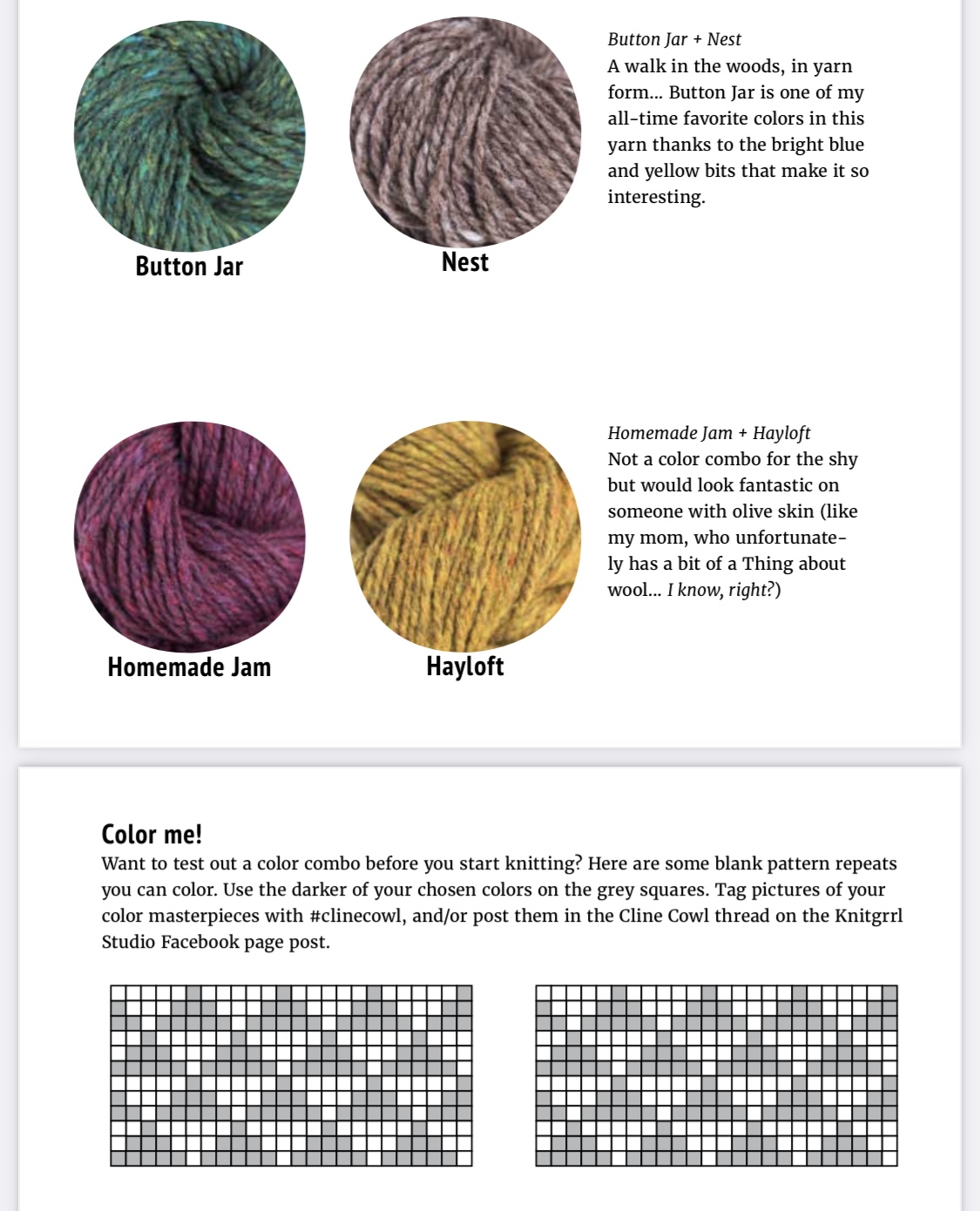
Ok, so how do we work on this in real life? Try knitting my Cline Cowl. After the pattern I provide some sample color combos in the same yarn to get you thinking and a full page of blank pattern chart repeats so you can test out different ones before you cast on. This is something you can reproduce for yourself with other patterns! Don’t feel that you have to be tied to the existing color choices of any colorwork pattern. Graph paper or even Excel can be your friend if you prefer noodling around digitally.
